“Čini mi se” lettering piece was something random and unexpected. It started as a joke that I had with my friends which was inspired by a song that my boyfriend showed me, and one day later I woke up at 5 am, I didn’t know what to do with myself after some stream of consciousness journaling because it was so early and I couldn’t get the song out of my head.
So, why not letter it?
For anyone curious, “Čini mi se” (Serbian Cyrillic: “Чини ми се”) means in English: “It seems to me,” and a part of that music video inspired the whole design around those words. Don’t ask me, but that’s how my brain works at 5 am. 😄 And it’s nice to get all sorts of random inspiration.
Since I already had my journal in my lap, I made the initial sketch. I wasn’t sure about the positioning, but I knew that I want to letter it in Cyrillic, since I rarely do that (when you’re trying to reach lots of people you want your audience to understand your work). But this month, I focused on making things that I want. It wasn’t much, but I’m happy that I’m showing this part of me. My 1st language isn’t English, it’s Serbian. And I don’t write in Latin unless I have to, I prefer Cyrillic more.
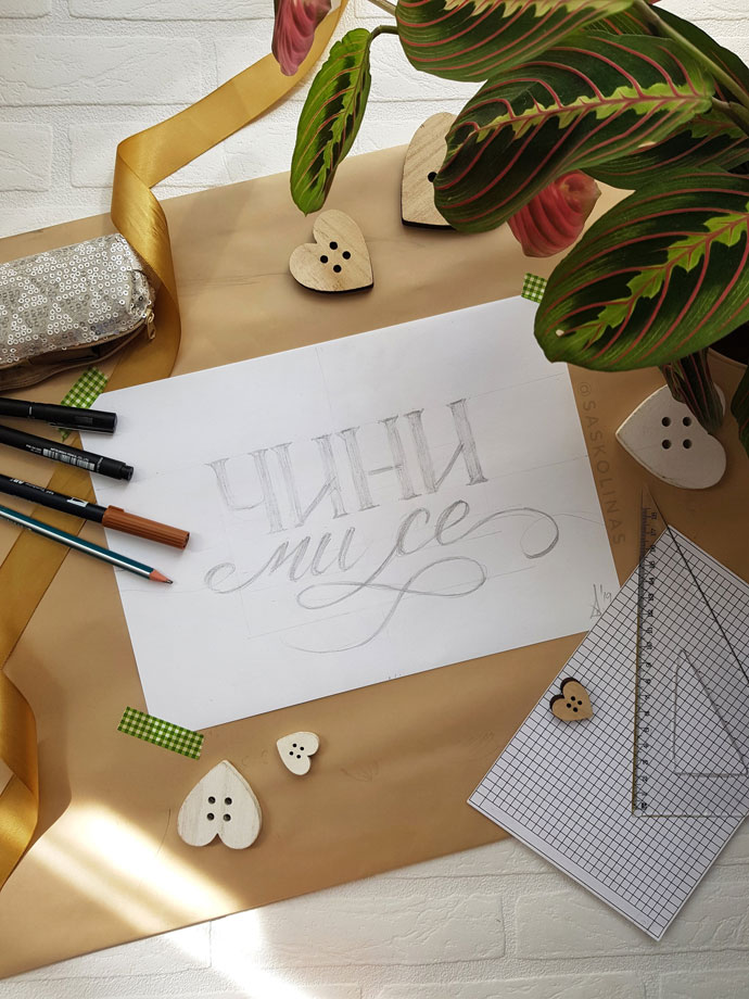
Now – back to the piece. I finished my 5 am sketch, and I liked it so much that I wanted to share it with the world. In the evening, I took my drawing board and a piece of paper, and I started sketching again. I got invested into making this piece exactly as I wanted.
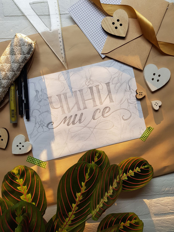
I revisited it after a few days when I got the time and took some time to refine it and add orchid and leaf illustration outlines.
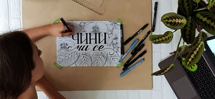
And then another idea came – Why not film the inking process?
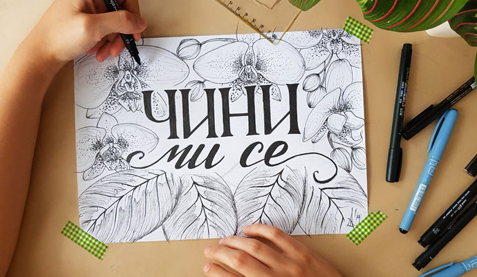
On the weekend, I took my filming setup and filmed the inking process. I gathered all of my black pens and started inking. First, I tried to use my brush pens, but they’re too dry that I had to switch to a thicker fineliner. I used a 0.7 fineliner to fill in the letters, and I used thinner 0.2 fineliner to draw the illustrations. I went back to polish the letters with 0.2 pen, and somewhere I used my ruler to straighten the lines because in some cases, my precision is failing me.
For orchid illustration, I found a photo reference on unsplash https://unsplash.com/photos/NR4ONKHblvo (Photo by Amelie Ohlrogge on Unsplash) and this baby was a challenge! I never tried stippling in my work because I know its tiring, but the photo reference has white orchids with pink dots and I wanted to challenge myself.
Note: If you’re not sure where to focus on more, you can always turn your photo black and white to see it more clearly, but it this case I just winged it. And it turned out just fine for my 1st take on stippling.
But, it’s tiring, and one tip from me if you try to do anything similar: Try to rest your hand when possible and if you can use your non-dominant hand – do it. I filmed my process in one take and I’m relying on daylight and limited phone battery to shoot it, so I switched between my left hand and my right hand when I did that stippling part.
After that, I added some lines to the flower petals to add some shading and dimension to them and then I moved onto the leaves.
I used my plant (Prayer leaf plant; I like to call her Mirinda) as a reference. It has such beautiful foliage, with red, light green and dark green parts, and in this piece, I tried to replicate that as much as I could. I divided the sections where I see the lighter parts and darker parts are shaded very lightly with 0.2 pen pointed at an angle, so I don’t use the full force to color it.
When I was happy with the way it looks, I took a step back to reevaluate the piece and see if anything needs to be added. And then I just slightly added more shading to the illustrations and voila! The piece is finished.
I think that I’ll color it digitally. It will be a nice practice.
x Saskolinas